Designing a New Annex for a Historic Johnson Space Center Facility

The most powerful aspects of any design are often the simplest. Chief among them is the ability of a well-connected design and planning team to distill the quintessential drivers of a project, to articulate them to a designer who can capture those drivers into their design.
This process played out in one of our latest projects for NASA’s Johnson Space Center (JSC) in Houston, Texas. We were chosen to incorporate a new annex onto Building 31, one of the historic buildings on the expansive property.
The project came as a result of a few years of planning and study – in fact, we drew up a concept for this building a few years ago. But that was just the first step toward a final design, which is much different than the concept.
Starting with a lightning rod
Building 31 at Johnson Space Center is just one of a sprawling campus for NASA’s Astromaterials Research and Exploration Science (ARES) group. The building holds a sizable portion of extraterrestrial samples NASA missions have collected over the years.
In the coming years, the building’s laboratory suites will house samples returning to Earth from the OSIRIS-REx and Hayabusa 2 asteroid research missions. RS&H designed the new lab suites.
With a new master plan designed to bring ARES’ sprawling campus closer together, the Building 31 Annex (or 31B) will add another 20,000 square feet of LEED-Silver laboratory space that will support Johnson Space Center’s core planetary science and curation capability.
We were encouraged to create a model of what the building annex could be, a process that spawned more aspects of master planning that helped the conceptual design become the basis for the bridging document. In January, our team met with representatives from all the lab groups within ARES to better understand the work they do and the building requirements of their work.
The litmus test comes when the designers return with that information. Have they been able to distill it down to the quintessential design components? As it turned out, our first model became a visual lightning rod for everyone to react to and voice their comments. There were plenty of challenges to factor in, too.
Designing with respect for history
Once we were awarded the project, we had already wrapped up a series of other studies that looked at the fabric of the ARES campus, examining all their facilities, courtyards and the human aspects of the program. We relieved some of the criteria from the first model and went back to the drawing board.
Not only did the next iteration achieve the square footage goals by reworking the second story of the facility, but it created a visually interesting mass that achieves some sculptural quality – even if the changes were designed to resolve the underground infrastructure issues.
In the original Building 31, there was discipline. It was expressed in the rhythm of the windows and the structure, in the engineering on the façade and in the floor.
The new annex speaks to that same level of discipline, but it reflects the discipline of our time. It’s like when I would stand next to my father – there are some striking resemblances, but I am my own man.
Working with JSC’s historic preservationists, we adjusted the annex structure to match the lines between the two buildings. We used tools that modern designers use, but we also used a couple that the original designers had in their tool kit. Not only did we build energy models and form generations in the digital world, but we built physical models, sketched and drew.
While modern engineering and architecture tools have moved our profession into spaces once only dreamed of, we still find value using the traditional practices when necessary. You’re engaged differently when you’re sketching and drawing.
As it turned out, these engagements were just what the Building 31 Annex needed.
A new design emerges
The expectations of a quality work environment have changed for engineers over time. They have greater expectations of quality of life in the workplace than what their counterparts in the 1960s envisioned. This building is a response to that.
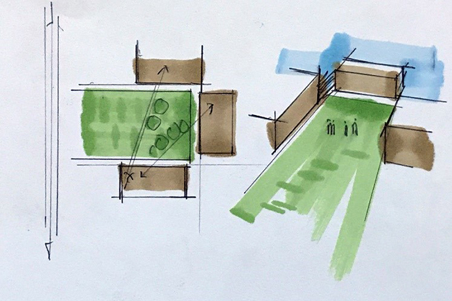
The building entries are oriented to the courtyards, which in turn promote their use.
From there, we begin to look at the cross-campus axes, how goods and services are brought to the buildings, and how the quality of the open green space can be maintained by keeping cars and service vehicles out of it. Additionally, prevailing winds and solar patterns are captured.
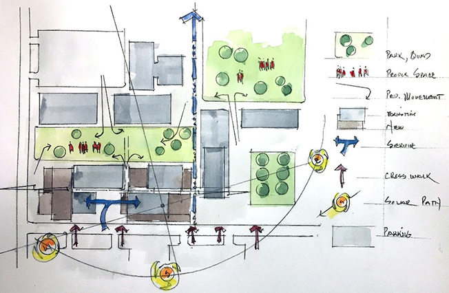
Now that we had an understanding for the most basic site constraints, we began to look inward.
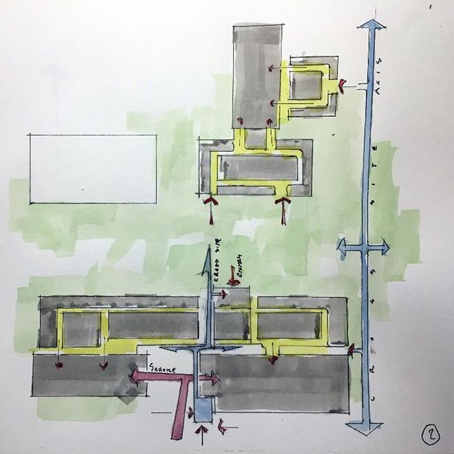
This diagram illustrates building entries service and internal circulation. One area of concern was captured with the internal circulation having no view to daylight, which was a common planning principle during the original site development in the 1960s.
Today, we strive to eliminate long dark corridors with no view to daylight. Interior spaces are better served when you have a sense of the time of day and weather. These views also help to orient you to the site beyond your space. We looked to have the major interior spaces like lobbies well positioned on these circulation paths and adjacent to major exterior spaces.
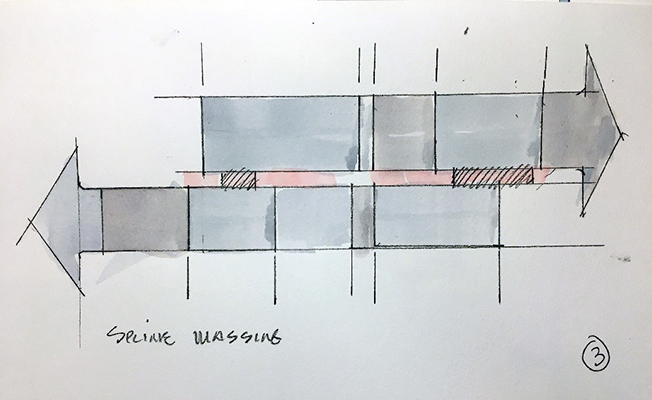
The buildings have a unique relationship along a central spline. One side predominantly features offices, while the other houses production, manufacturing and fabrication. These align in one direction but not in the other.
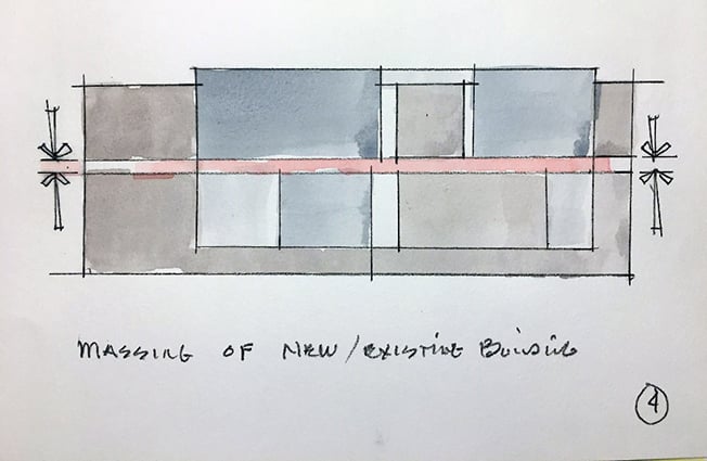
Building upon this circulation spline concept, the new architectural masses create a simple form with the existing facades slightly stepped forward. The movement line organizational concept is maintained with production facilities and manufacturing on one side office and engineering on the other.
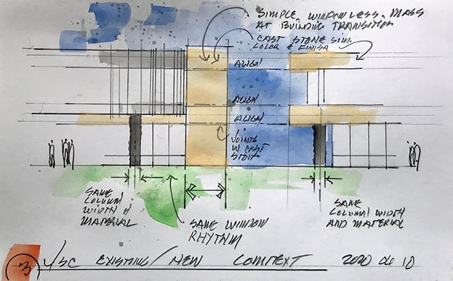
The following diagrams illustrate how we look to make sizable building additions compatible with the existing architectural character. The most basic aspect is massing, followed by the general horizontal lines, next is material selection, and how those materials are further subdivided. It should be noted that we’re not trying to make a duplicate of the original building.
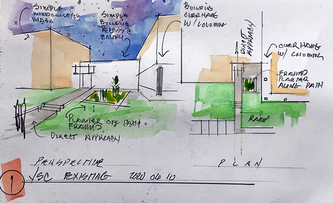
The new building reflects these organizational elements. The new sidewalk very directly aligns with the door, while a planter is on the opposite side in a small courtyard. The addition of a large architectural mass to the left allows for transition in building rhythms and for each to stand on its own merits.
These design choices reconnect us with the environment. That repeats itself on the upper level, but the glass is more obscuring. The engineered façade maintains the lines and proportions of the adjacent building. The cast stone panels also match the original.
So much of our design is to project life and movement in this new space. Once you consider the science that will be studied inside these walls, the potential can hardly be measured.
Learn how RS&H’s aerospace services and laboratory design experts can help bring your next project to life.
